深度学习模型图表理解chart2txt-8个模型对比实验
背景
为了实现RAG图表理解,测试多模态大模型和一些最新的chart2txt方法
多模态大模型测试Prompt
你是一位专门为图像创建文本描述的文件分析专家。
你将收到一张图片或图表。你的任务是创建该图像的简短描述。
说明:
1. 仔细检查提供的图像。
2. 分析从图像中提取的任何文本。
3. 输出对图像的忠实描述。确保包含足够的细节以准确重建图像。如果图像是图表或包含数值数据,请在输出中包含这些数值数据。
示例:
输入:
一张图表
输出:
在这张图表中,一个标题为"水果偏好调查"的柱状图显示了人们偏好不同类型水果的数量。x轴显示水果类型,y轴显示人数。柱状图显示大多数人更喜欢苹果,其次是香蕉和橙子。20人喜欢苹果,15人喜欢香蕉,10人喜欢橙子。
测试环境:3090单卡
测试效果
| 模型 | 数据1:饼图 | 数据2:折线图 | 数据3:流程图 | 评价 |
|---|---|---|---|---|
 |
 |
 |
||
| MiniCPM-V-2_6 vllm |
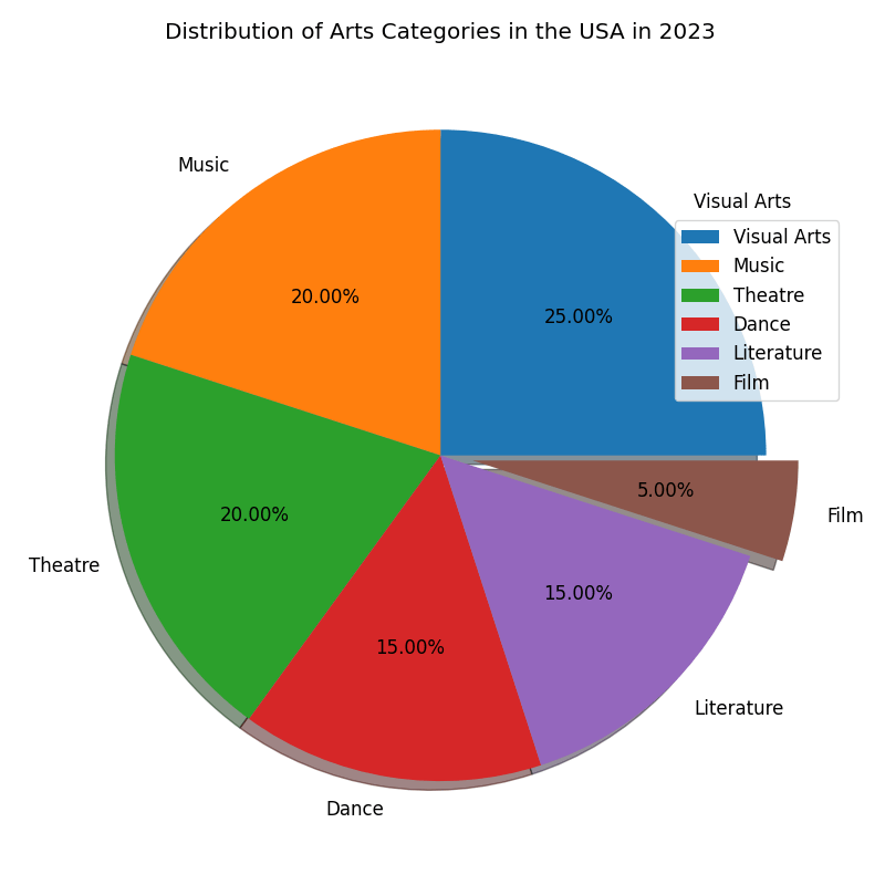
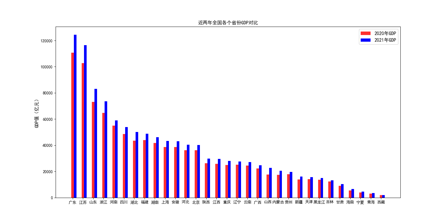
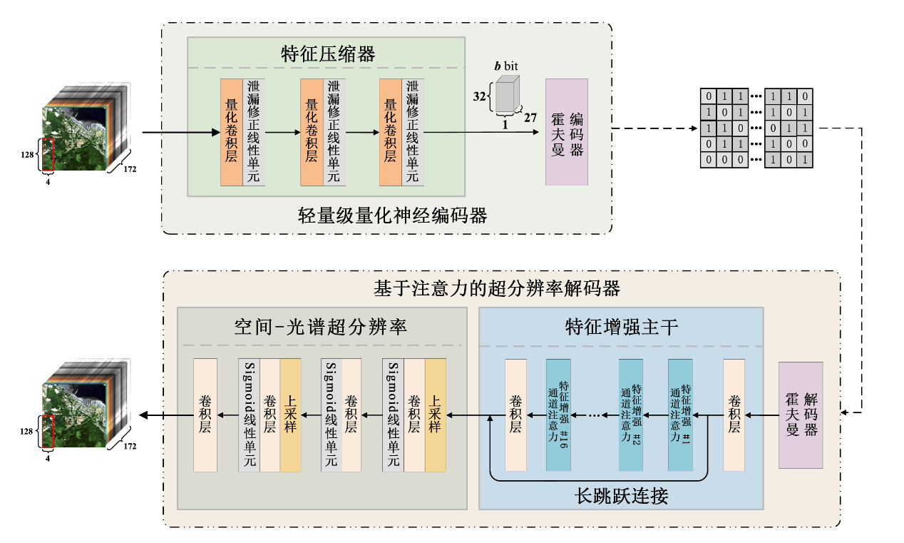
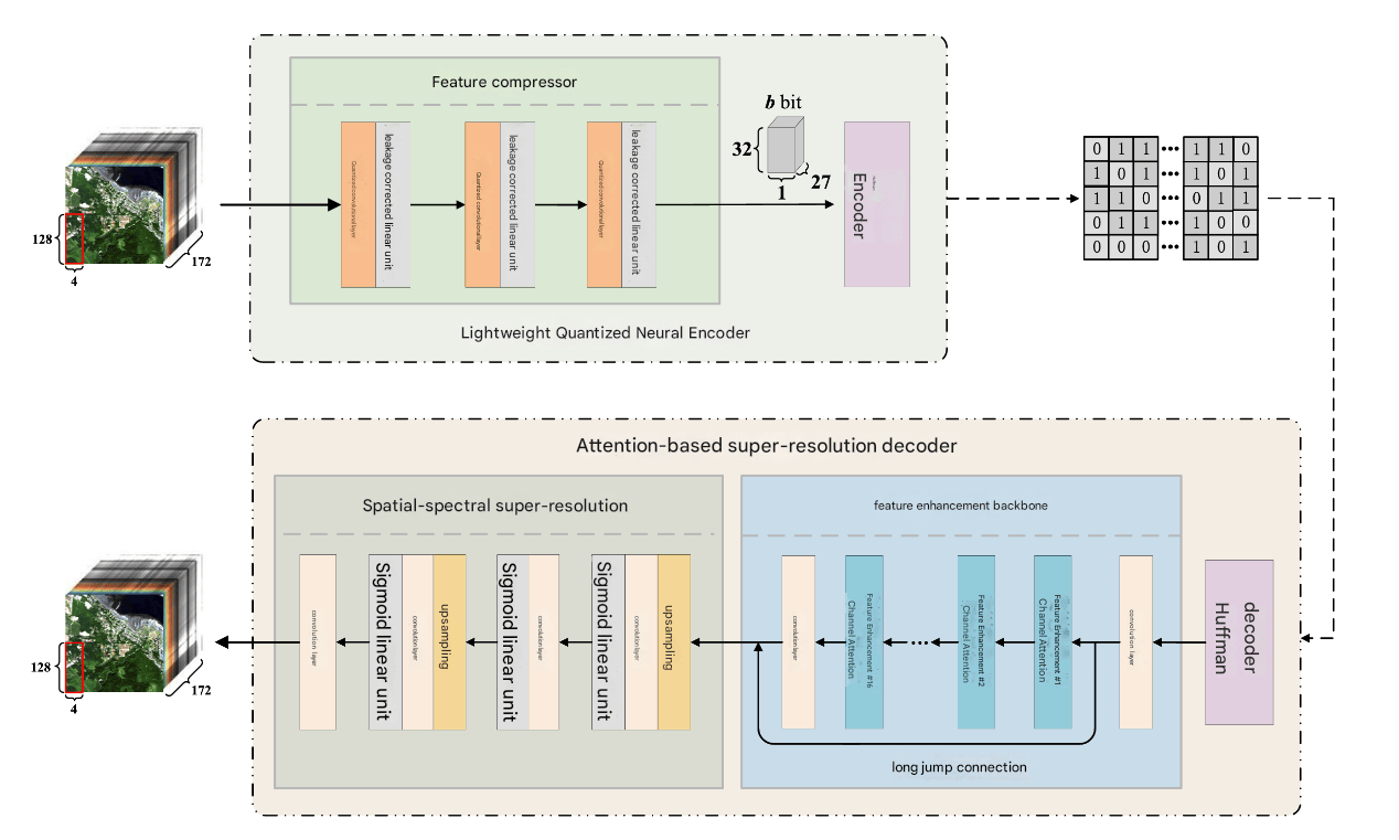
这张饼图显示了2023年美国艺术类别分布。最大的部分是视觉艺术,占25%。音乐和戏剧各占20%,舞蹈和文学各占15%。最小的部分是电影,仅占5%。 | 这幅图像是一幅条形图,比较了中国各省在2020年和2021年的GDP。图表的标题是“近两年中国各省GDP对比”。x轴显示了省份的名称,从左到右依次是:广东、江苏、山东、浙江、河南、四川、湖北、福建、湖南、上海、安徽、河北、北京、陕西、重庆、辽宁、云南、广西、山西、内蒙古、贵州、新疆、天津、黑龙江、吉林、甘肃、海南、宁夏、青海、西藏。y轴表示GDP值,单位为亿元人民币。每个省份都有两根条形图,一根代表2020年的GDP,另一根代表2021年的GDP。2020年的GDP用红色表示,2021年的GDP用蓝色表示。从图表中可以看出,广东省的GDP最高,其次是江苏省和山东省。 | 这张图片展示了两个不同的神经网络架构,分别用于特征压缩和基于注意力的超分辨率解码。在顶部架构中,输入图像通过特征压缩器处理,该压缩器包括一个卷积层和一个量化卷积层。然后,经过压缩的特征被传递到轻量级量化神经编码器,该编码器进一步处理特征并输出一个压缩的表示。在底部架构中,输入图像首先通过空间-光谱超分辨率模块处理,该模块包括卷积层和上采样层。然后,经过处理的特征被传递到基于注意力的超分辨率解码器,该解码器包括特征增强主干和解码器,其中长跳跃连接用于特征增强。整个架构旨在高效地处理和解码图像特征,可能用于图像压缩和增强任务。 | 流程图下半部分的顺序错了,应该是从右到左而不是从左到右。 |
| MiniCPM-o-2_6 vllm 单并发占用13444 MiB |
这张图片是一个饼图,展示了2023年美国艺术类别的分布。饼图被分为六个部分,每个部分代表不同的艺术类别,并标有相应的百分比。最大的部分是视觉艺术,占25.00%,其次是音乐和戏剧,各占20.00%。舞蹈和文学各占15.00%,而电影则占最小的部分,仅占5.00%。每个部分都用不同的颜色表示,饼图旁边有一个图例,将每个颜色与相应的艺术类别关联起来。 | 这张图表展示了2020年和2021年全国各省份的GDP对比。图表的标题是“近两年全国各省份GDP对比”。图表中有两组柱状图,分别代表2020年和2021年的GDP数据。每个柱状图的颜色分别为红色和蓝色,红色代表2020年的数据,蓝色代表2021年的数据。x轴列出了各省份的名称,从左到右依次是广东、江苏、山东、浙江、河南、四川、湖北、福建、湖南、上海、安徽、河北、北京、陕西、江西、重庆、辽宁、云南、广西、山西、内蒙古、贵州、新疆、天津、黑龙江、吉林、甘肃、海南、宁夏、青海、西藏。y轴表示GDP值,单位为亿元,范围从0到120000亿元。从图表中可以看出,2020年和2021年各省份的GDP值存在差异,但具体数值需要进一步分析数据标签。 | 这张图片展示了两个主要部分,每个部分都包含一个流程图,描述了图像处理和压缩过程。顶部部分标有“特征压缩器”和“轻量级量化神经编码器”,显示了从图像到压缩数据的流程,包括“泄漏修正线性单元”和“霍夫曼编码器”。底部部分标有“基于注意力的超分辨率解码器”和“特征增强主干”,显示了从压缩数据到解码图像的流程,包括“空间-光谱超分辨率”和“长跳跃连接”。流程图中包含各种处理步骤,如“卷积层”和“上采样”,以及“Sigmoid线性单元”。 | 对图表结构的描述很好,但没有分析数值趋势。 |
| Qwen2.5-Omni-7B vllm |
这是一张饼图,标题是“2023年美国艺术类别分布”。饼图被分为六个部分,分别是视觉艺术,音乐,戏剧,舞蹈,文学和电影。视觉艺术占25%,音乐和戏剧各占20%,舞蹈和文学各占15%,电影占5%。每个部分都有相应的颜色标识,比如视觉艺术是蓝色,音乐是橙色等等。你要是还有啥想法或者问题,随时跟我说哈。 | 这是一张柱状图,标题为“近两年全国各个省份GDP对比”。x轴是省份名称,y轴是GDP值,单位是亿元。图例显示红色代表2020年GDP,蓝色代表2021年GDP。从图中可以看到,广东,江苏,山东等省份2021年GDP明显高于2020年,而西藏等省份2021年GDP相对较低。 | 这张图包含两个部分。上方是“轻量级量化神经编码器”,中间有“特征压缩器”几个字,右侧是“霍夫曼编码器”。左侧是一个128×172的图像,经过一系列处理,最后输出32比特的数据。下方是“基于注意力的超分辨率解码器”,左侧是“空间-光谱超分辨率”,右侧是“特征增强主干”,还有“长跳跃连接”字样。左侧的图像经过处理后,经过“卷积层”“Sigmoid线性单元”“上采样”等步骤,最后输出。右侧的“特征增强主干”包含多个“特征增强注意力”和“卷积层”。 | 流程图下面的顺序不准确。 |
| Qwen2.5-Omni-3B vllm 单并发占用13444 MiB |
这张图表展示了2023年美国艺术类别分布情况。其中,视觉艺术占比25%,音乐占比20%,戏剧占比20%,舞蹈占比15%,文学占比15%,电影占比5%。你要是还有啥想法或者问题,随时跟我说哈。 | 这张图表是“近两年全国各个省份GDP对比”。横轴是省份,纵轴是GDP值,单位是亿元。2020年GDP用红色柱状图表示,2021年GDP用蓝色柱状图表示。从图中可以看出,广东省2020年GDP约为115000亿元,2021年约为120000亿元,是全国GDP最高的省份。江苏省2020年GDP约为100000亿元,2021年约为115000亿元。 | 这张图像是一个关于图像处理的结构图。最上面是特征压缩器,里面有量化卷积层和霍夫曼编码器。量化卷积层有4个,霍夫曼编码器的输入是32bit,输出是27bit。中间是轻量级量化神经编码器,输入是一个图像,输出是量化后的数据。下面是基于注意力的超分辨率解码器,有空间 - 光谱超分辨率和特征增强主干两个部分。空间 - 光谱超分辨率部分有卷积层,Sigmoid线性单元和上采样单元。特征增强主干部分有卷积层,Sigmoid线性单元,上采样单元,通道注意力,特征增强通道注意力,长跳跃连接等。输入是128x172的图像,输出是128x172的图像。如果还有其他问题,欢迎随时问我。 | 流程图有一些不准确,”量化卷积层有4个“不对,应该是3个。 |
| Qwen2.5-VL-3B-Instruct vllm |
这张图表展示了2023年美国艺术类别分布情况。图表分为六个部分,每个部分代表一个艺术类别。每个类别用不同颜色表示,并用百分比表示其在总艺术类别中的比例。具体类别及其百分比如下:视觉艺术占25%,音乐占20%,戏剧占20%,舞蹈占15%,文学占15%,电影占5%。 | 这张图表展示了2020年和2021年全国各省份的GDP对比。图表的x轴表示省份,y轴表示GDP值(亿元)。2020年和2021年的GDP值分别用红色和蓝色的柱状图表示。从图表中可以看出,广东省和江苏省的GDP值最高,远高于其他省份。 | 这张图片展示了一个图像处理和超分辨率重建的框架。框架分为两个主要部分:轻量级量化神经编码器和基于注意力的超分辨率解码器。 轻量级量化神经编码器: 输入图像是一个128x172的图像,表示为一个3D立方体。 输入图像通过量化卷积层进行处理,量化卷积层通过量化线性单元进行操作。 处理后的图像通过霍夫曼编码器进行编码,编码器将图像转换为32位的二进制表示。于注意力的超分辨率解码器 输入图像同样是一个128x172的图像,表示为一个3D立方体。 输入图像通过卷积层进行处理,卷积层通过Sigmoid线性单元进行操作。 处理后的图像通过特征增强主干进行进一步处理,特征增强主干包含多个卷积层和特征增强注意力模块。 处理后的图像通过霍夫曼解码器进行解码,解码器将二进制表示转换回图像。整个框架通过长跳跃连接进行特征传递,确保了图像处理的连续性和准确性。 |
流程图下面的顺序不准确。 |
| minimind-v Transformers 1108 MiB |
图片中的图片显示了一个人坐在柱状图像中,他旁边放着一台笔记本电脑。他可能正在查看或与他人分享他们所看到的苹果。在图像中,一张黑白照片显示了四个人,他们都在看和讨论他们所看到的苹果。在柜台上,有两个人坐在柜台上,其中一人站在柜台前,另一人则站在柜台后面。这张照片显示了一种更广泛的视觉视角,包括与他人交流、分享和展示水果。 | 该图显示了一张图片,显示了一个人在图像中的柱状图片。图中有四个人,其中一个在左边,另外两个在右边。柱状图显示了图片中人数众多的不同人群。总体而言,这张图片捕捉到了人们对水果偏好和偏好的欣赏。 | 图示中,一张纸上出现了两张标题,一张正对着图片中的人。在图片中,左侧有一张坐垫,右侧有一只手。总共有11张椅子,其中一张靠近左边,另一张在右边。图像中还出现了另一张人,其中两个人更靠后一些。此外,还有两个人在图像中,其中一人站在左侧,另一人站在右侧。总共有四个人,其中一人站在左侧,另一人站在右侧。总体而言,图片展示了一个人偏好调查、分析和选择水果偏好,他们正在分享有关该图片的详细信息。 | 一个非常小的模型,对于自然图像理解的还不错,但是可视化图表效果很差,可能微调后效果会好。 |
| TinyChart 8128 MiB |
The chart represents the distribution of different arts categories including Visual Arts, Music, Theater, Dance, Literature, and Film. The categories are arranged along the circumference of the chart while the radial distance from the center signifies the proportion of each category. The chart displays a bimodal trend with two distinct peaks, the first peak for Visual Arts accounting for 25% and the second peak for Music at 20%. These peaks indicate the highest popularity or emphasis given to these categories. A significant drop can be observed from Music to Theater, with a gap of 15% indicating the lesser popularity of Theater. Similarly, there is a noticeable decline from Dance to Film, with a gap of 10% indicating the lower popularity of Film.The categories with the least popularity are Film and Literature, with Film accounting for 5% and Literature for 15%. These categories contribute to the least overall popularity in the chart.The chart has a relatively stable trend with only slight fluctuations, except for the sudden drop from Dance to Film. The data points are connected by a semi-transparent line colored in gray, which adds a sense of continuity in the chart.The chart has a large circle with a radius of 50, providing ample space to display the data. The chart’s background is set to light gray, ensuring the data is clearly visible. A grid is also incorporated into the chart to aid in reading and interpreting the data.Note: There is no provided raw CSV data to create the chart. Please provide the necessary data. 图表显示了不同艺术类别的分布,包括视觉艺术、音乐、戏剧、舞蹈、文学和电影。类别沿着图表的圆周排列,而与中心的径向距离表示每个类别的比例。图表显示了双峰趋势,有两个明显的高峰,第一个高峰是视觉艺术,占25%,第二个高峰是音乐,占20%。这些峰值表明这些类别最受欢迎或最受重视。从音乐到戏剧,可以观察到明显的下降,差距为15%,表明戏剧的受欢迎程度较低。同样,从舞蹈到电影也有明显的下降,差距为10%,表明电影的受欢迎程度较低。最不受欢迎的类别是电影和文学,电影占5%,文学占15%。这些类别是图表中最不受欢迎的。图表的趋势相对稳定,只有轻微的波动,除了从舞蹈到电影的突然下降。数据点由一条半透明的灰色线连接,这在图表中增加了一种连续性。图表有一个半径为50的大圆,为显示数据提供了充足的空间。图表的背景设置为浅灰色,确保数据清晰可见。图表中还加入了网格,以帮助阅读和解释数据。**注:**没有提供原始CSV数据来创建图表。请提供必要的资料。 |
The image presents a comparative analysis of COVID-19 cases across different periods, as labeled in the X-axis. The Y-axis denotes the number of cases. Two sets of data, ‘2000-2004’ and ‘2021-2030’, are represented in the chart, with the latter set of data exhibiting a significantly higher number of cases.The chart employs a bar representation, where each bar corresponds to a specific period and the height of the bar indicates the number of cases during that period. The bars are distinctly colored, with a black edge color, set against a light gray background, which aids in distinguishing between the bars.A grid is included in the chart to facilitate a more straightforward comparison of the bars. The bars are also annotated with their corresponding data values at the top, allowing for a quick and accurate understanding of the exact number of cases for each period.The chart shows a consistent increase in COVID-19 cases from the year 2000 to 2004, with the number of cases rising from 100,000 to 120,000. However, there is a sudden drop in 2005 to 80,000 cases. The cases then start to gradually increase again until 2007, reaching 100,000 cases.From 2008 to 2011, the chart exhibits a bimodal trend with two distinct peaks in 2009 and 2011, with the number of cases reaching 140,000 and 150,000 respectively. After 2011, there’s a steady decline in cases until 2015, reaching 70,000.A significant increase is observed in 2016, with the number of cases jumping to 150,000, and this upward trend continues until 2019, reaching 200,000 cases. The final period of the chart, 2020-2021, shows a slight decrease in cases to 100,000.The chart clearly illustrates the drastic increase in COVID-19 cases from 2000 to 2021, with several periods of sudden spike, indicating the unpredictable nature of the virus. 该图显示了不同时期COVID-19病例的比较分析,如x轴所示。y轴表示病例数。图表中显示了“2000-2004年”和“2021-2030年”两组数据,后一组数据显示的病例数量要高得多。该图表采用柱状表示,每个柱状表示一个特定时期,柱状的高度表示该时期的病例数。这些条的颜色很明显,黑色的边缘颜色与浅灰色的背景相衬,这有助于区分这些条。图表中包含一个网格,以便更直接地比较条形图。这些柱状图的顶部还标注了相应的数据值,以便快速准确地了解每个时期的确切病例数量。该图显示,从2000年到2004年,COVID-19病例持续增加,病例数从10万增加到12万。然而,2005年突然下降到8万例。然后,病例开始逐渐增加,直到2007年达到10万例。从2008年到2011年,图表呈现双峰趋势,2009年和2011年有两个明显的高峰,病例数分别达到14万和15万。2011年之后,病例稳步下降,直到2015年,达到7万例。2016年出现显著增长,病例数跃升至15万例,这一上升趋势一直持续到2019年,达到20万例。图表的最后一个时期,即2020-2021年,病例略有减少,降至10万例。该图清楚地说明了从2000年到2021年COVID-19病例的急剧增加,其中有几个时期突然飙升,表明该病毒的不可预测性。 |
The image presents an irregular pattern, with varying shades of color representing different data points. The pattern is composed of several lines, each with a unique style and marked with circular points. The lines cross each other multiple times, creating a complex network of intersecting lines. The background of the image is light gray, with a grid added to aid in visualizing the data points. There is a legend in the upper right corner of the image, but it only provides information about the colors used, not the corresponding data they represent. As for the specific data represented, there is a fluctuation in values across the image. The highest value is represented at two points, showing a bimodal trend. The values also exhibit a significant increase at one point, followed by a substantial drop, indicating a sudden and significant change in the data. There are also several outliers in the data, marked by sudden spikes or drops, suggesting events or anomalies that caused these sudden changes. The image does not provide enough information to accurately determine the exact data. However, based on the visual patterns and trends, one can make educated guesses about the data, taking into account the possible presence of outliers and the sudden changes indicated by the high volatility. 图像呈现出不规则的图案,不同的颜色深浅代表不同的数据点。图案由几条线组成,每条线都有独特的风格,并标有圆形点。这些线相互交叉多次,形成了一个复杂的相交线网络。图像的背景是浅灰色的,并添加了网格以帮助可视化数据点。在图像的右上角有一个图例,但它只提供有关所使用的颜色的信息,而不是它们所代表的相应数据。对于所表示的具体数据,在整个图像中存在值的波动。最高值在两点处表示,呈双峰趋势。这些值在某一点上也表现出显著的增加,随后又大幅下降,表明数据发生了突然而显著的变化。数据中也有一些异常值,以突然的峰值或下降为标志,表明导致这些突然变化的事件或异常。图像没有提供足够的信息来准确地确定确切的数据。然而,基于视觉模式和趋势,人们可以对数据做出有根据的猜测,考虑到可能存在的异常值和高波动性所指示的突然变化。 |
识别的效果差,而且幻觉严重。 |
| ChartVLM 22876 MiB 图表认知(调用LLM) |
The provided image is a pie chart displaying the distribution of various arts categories in the USA in 2023. The chart is labeled “Distribution of Arts Categories in the USA in 2023.” The different categories represented in the chart are: Visual Arts (25%), Music (20%), Theatre (15%), Dance (15%), Literature (5%), and Film (5%). 所提供的图像是一个饼状图,显示了2023年美国各种艺术类别的分布。这张图表的标题是“2023年美国艺术类别的分布”。图表中代表的不同类别是:视觉艺术(25%)、音乐(20%)、戏剧(15%)、舞蹈(15%)、文学(5%)和电影(5%)。 |
爆显存 | The provided image is a candlestick chart showing the stock price trend of a company called “ABITTEAR” from 2000 to 2022. The chart is labeled with the company’s name and the title “2022 Chinese Stock Price Trend.” The x-axis represents the years, while the y-axis represents the stock prices.The chart shows a slow increase in stock prices from 2000 to 2010, followed by a slight decline in 2011. The stock price then gradually increases again until it reaches its peak in 2019 at around 12.0. In 2020, the stock price drops to around 10.0, and then recovers slightly in 2021, reaching around 10.5. However, in 2022, the stock price drops significantly, reaching a low of around 5.0 in January and February before recovering slightly to around 6.0 in March.Overall, the chart shows a volatile stock price trend for ABITTEAR, with significant fluctuations over the years. 图为“ABITTEAR”公司从2000年到2022年的股价走势的烛台图。图表上标有该公司的名称和标题“2022年中国股价趋势”。x轴代表年份,y轴代表股价。图表显示2000年至2010年股票价格缓慢上涨,随后在2011年略有下降。然后,股价再次逐渐上涨,直到2019年达到12.0左右的峰值。2020年,股价跌至10.0左右,2021年略有回升,达到10.5左右。然而,在2022年,股价大幅下跌,在1月和2月达到5.0左右的低点,然后在3月略有回升至6.0左右。总的来说,图表显示了ABITTEAR的股价波动趋势,多年来波动很大。 |
效果差 |
| ChartVLM 图表感知(pix2struct) |
Category \t Percentage \n Visual Arts \t 25% \n Music \t 20% \n Theatre \t 15% \n Dance \t 15% \n Literature \t 5% \n Film \t 5% \n 显存:2506 MiB |
Characteristic \t 2020-16 GDP \t 2021-17 GDP \n 7-8 \t 110000 \t 124000 \n 9-10 \t 103000 \t 116000 \n 11-12 \t 102000 \t 117000 \n 13-14 \t 73000 \t 82000 \n 15-17 \t 64000 \t 74000 \n 18-19 \t 57000 \t 56000 \n 20-24 \t 49000 \t 52000 \n 25-29 \t 43000 \t 48000 \n 30-34 \t 41000 \t 49000 \n 35-39 \t 40000 \t 46000 \n 40-44 \t 39000 \t 42000 \n 45-49 \t 37000 \t 40000 \n 50-54 \t 35000 \t 40000 \n 55-59 \t 32000 \t 40000 \n 60-64 \t 30000 \t 35000 \n 65-69 \t 28000 \t 30000 \n 70-74 \t 27000 \t 30000 \n 75-79 \t 25000 \t 30000 \n 80-84 \t 22000 \t 20000 \n 85-89 \t 20000 \t 19000 \n 90-94 \t 17000 \t 16000 \n 95-99 \t 15000 \t 15000 \n 100-110 \t 13000 \t 13000 \n 120-125 \t 11000 \t 12000 \n 130-14 \t 10000 \t 10000 \n 150-15 \t 9000 \t 10000 \n 160-16 \t 8000 \t 9000 \n 170-17 \t 6000 \t 7000 \n 180-18 \t 5000 \t 5000 \n 190-19 \t 4000 \t 4000 \n 200-24 \t 3000 \t 3000 \n 250-29 \t 2000 \t 2500 \n 300-34 \t 1500 \t 1000 \n 350-39 \t 1000 \t 1000 \n 400-44 \t 800 \t 1000 \n 450-49 \t 700 \t 1000 \n 500-54 \t 600 \t 1000 \n 550-59 \t 500 \t 500 \n 600-59 \t 400 \t 500 \n 610-59 \t 300 \t 500 \n 620-58 \t 200 \t 500 \n 630-57 \t 150 \t 500 \n 640-56 \t 100 \t 500 \n 650-59 \t 50 \t 500 \n 660-59 \t 30 \t 50 \n 700-74 \t 20 \t 50 \n 750-79 \t 10 \t 50 \n 800-84 \t 5 \t 0 \n 850 \t 2 \t 0 \n 850 \t 1 \t 0 \n 显存:8754 MiB |
Characteristic \t ABITTEAR \t ABITTEAR \t ABITTEAR \n 2019/20 \t 12.0 \t 10.0 \t 10.0 \n 2018/19 \t 11.0 \t 9.0 \t 9.0 \n 2017/18 \t 10.0 \t 8.0 \t 8.0 \n 2016/17 \t 9.0 \t 7.0 \t 8.0 \n 2015/16 \t 8.0 \t 6.0 \t 7.0 \n 2014/15 \t 8.0 \t 5.0 \t 7.0 \n 2013/14 \t 7.0 \t 4.0 \t 7.0 \n 2012/13 \t 7.0 \t 3.0 \t 7.0 \n 2011/12 \t 7.0 \t 2.0 \t 7.0 \n 2010/11 \t 7.0 \t 1.0 \t 7.0 \n 2009/10 \t 7.0 \t 1.0 \t 7.0 \n 2008/09 \t 7.0 \t 1.0 \t 7.0 \n 2007/08 \t 7.0 \t 1.0 \t 7.0 \n 2006/07 \t 6.0 \t 1.0 \t 7.0 \n 2005/06 \t 5.5 \t 1.0 \t 7.0 \n 2004/05 \t 5.0 \t 0.9 \t 7.0 \n 2003/04 \t 5.0 \t 1.0 \t 7.0 \n 2002/03 \t 5.0 \t 1.0 \t 7.0 \n 2001/02 \t 5.0 \t 1.0 \t 7.0 \n 2000/01 \t 5.0 \t 1.0 \t 7.0 \n 显存:2514 MiB |
vllm版本:0.8.5
python examples/offline_inference/vision_language.py --modality image --model-type qwen2_5_omni --num-prompts 1
其它小模型方法方法
TinyChart
作者:阿里+人大
发布时间:2024
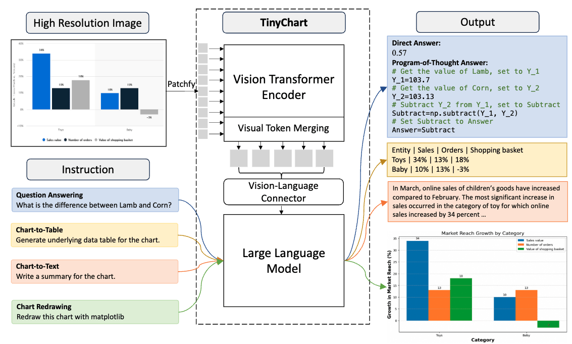
先把图片embedding为token,再和文本token一起输入到transformer decoder,本质上是一个视觉大模型。
上面测试效果不好,怀疑是这个模型只支持英文,对中文理解不好,所以把后两个中文case转成英文再试一次
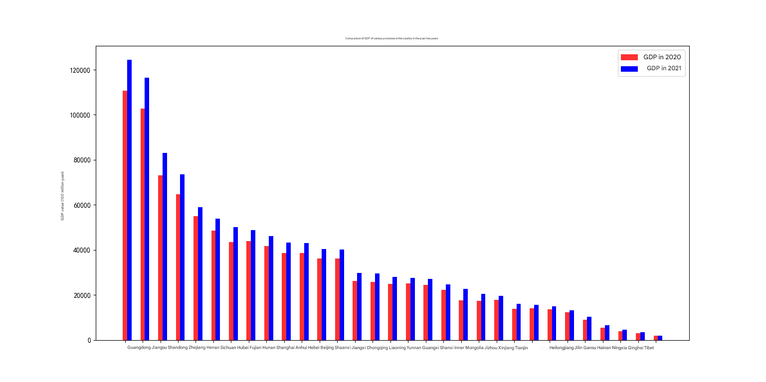 |
 |
|---|---|
| The chart depicts the GDP of various countries in the years 2020 and 2021. The country with the highest GDP in 2020 was the United States with a value of 100,000. However, in 2021, it was China with a GDP of 120,000. Both the United States and China have shown a significant increase in their GDP over the five-year period. Another notable observation is the GDP of India, which fell from 80,000 in 2020 to 75,000 in 2021, marking the first decline in over a decade. This could be attributed to the economic impacts of the COVID-19 pandemic. On the other hand, countries like Germany, France, and Australia have shown a steady increase in their GDP over the years. Despite a minor drop in 2021 for Germany, France, and Australia from the previous year, their GDP remained higher than those of many other countries.The GDP of Brazil, which fell from 90,000 in 2020 to 68,000 in 2021, also showed a significant decrease. This could be attributed to the economic impacts of the pandemic as well as the decrease in oil prices. In contrast, countries like the United Kingdom, South Africa, and Mexico showed a slight increase in their GDP in 2021, despite experiencing significant drops in 2020. The United Kingdom’s GDP increased from 85,000 in 2020 to 90,000 in 2021, while South Africa’s GDP rose from 75,000 in 2020 to 78,000 in 2021. Mexico’s GDP increased from 70,000 in 2020 to 75,000 in 2021.The GDP of Russia, which fell from 120,000 in 2020 to 100,000 in 2021, experienced a significant drop. This could be attributed to the economic impacts of the pandemic as well as the decrease in oil prices. Lastly, the GDP of China, which remained stable at 120,000 in 2020 and 2021, showed a slight increase from the previous year. This could be attributed to the increase in manufacturing and construction activities. In conclusion, this chart provides a comparative analysis of the GDP of various countries over the years 2020 and 2021, with detailed explanations for each observation. 该图表描绘了2020年和2021年各国的GDP。2020年GDP最高的国家是美国,价值10万。然而,到2021年,中国的GDP为12万美元。在过去的五年里,美国和中国的国内生产总值都有了显著的增长。另一个值得注意的观察是印度的GDP,从2020年的8万下降到2021年的7.5万,这是十多年来的首次下降。这可能是由于新冠肺炎大流行对经济造成的影响。另一方面,德国、法国和澳大利亚等国的国内生产总值多年来稳步增长。尽管2021年德国、法国和澳大利亚的GDP较前一年略有下降,但它们的GDP仍高于许多其他国家。巴西的GDP从2020年的9万美元下降到2021年的6.8万美元,也出现了明显的下降。这可归因于疫情对经济的影响以及油价下跌。相比之下,英国、南非和墨西哥等国的GDP在2021年略有增长,尽管在2020年经历了大幅下降。英国的GDP从2020年的8.5万增长到2021年的9万,南非的GDP从2020年的7.5万增长到2021年的7.8万。墨西哥的GDP从2020年的7万增加到2021年的7.5万。俄罗斯的GDP从2020年的12万下降到2021年的10万,出现了大幅下降。这可归因于疫情对经济的影响以及油价下跌。最后,中国的GDP在2020年和2021年保持稳定在12万,比上年略有增长。这可归因于制造业和建筑业活动的增加。总而言之,这张图表提供了2020年和2021年各国GDP的比较分析,并对每个观察结果进行了详细的解释。 |
The image presents an analysis of different exercise habits, specifically focusing on the number of hours spent on various types of exercise per week. The data is organized into a table, with each row representing a different type of exercise such as “Yoga”, “Weightlifting”, “Running”, “Swimming”, “Cycling”, “Tennis”, “Rowing”, and “Soccer”. The columns of the table display the duration of each exercise in hours. The data shows irregular fluctuations with no clear trend, as the hours spent on different exercises vary erratically from week to week. For instance, one week, a person might spend hours practicing yoga, while the next week, they could spend hours weightlifting. The time spent on running, swimming, cycling, and tennis shows a consistent decrease followed by a sudden increase. The row representing “Yoga” shows a declining trend with a sudden jump, indicating that the person spent less time practicing yoga recently, but then suddenly started spending more time on it. The “Weightlifting” row shows an increase with a sudden drop, suggesting a consistent rise in the time spent weightlifting, followed by a sudden decrease. The “Running” row displays a sudden spike, indicating a significant increase in the time spent running suddenly. The “Swimming” row shows a bimodal trend with two distinct peaks, signifying two separate periods of substantial increases in swimming hours. The “Cycling” and “Soccer” rows show a steady increase in the time spent cycling and soccer, respectively. The “Long-jumping” row has a sudden drop, suggesting a significant decrease in the time spent practicing long-jumping. The bars in the chart are color-coded, and a legend is provided in the upper right corner, which makes it easy to distinguish between different rows. The chart’s background is light gray, and grid lines are added to aid in reading the data. In terms of the number of hours spent on each exercise, running is the most popular with 150 hours spent per week, followed by yoga with 120 hours, and swimming with 110 hours. However, there are significant outliers, such as the sudden spike in running hours to 200 and the sudden drop in yoga hours to 70. Overall, the chart provides a comprehensive view of the variations in the time spent on different types of exercises, highlighting the erratic fluctuations and sudden drops that characterize the data. 这张图展示了对不同运动习惯的分析,特别关注每周花在不同类型运动上的时间。数据被组织成一个表,每一行代表一种不同的运动类型,如“瑜伽”、“举重”、“跑步”、“游泳”、“骑自行车”、“网球”、“赛艇”和“足球”。表格的列以小时为单位显示每个练习的持续时间。数据显示出不规则的波动,没有明显的趋势,因为花在不同运动上的时间每周都在不规律地变化。例如,这一周,一个人可能花几个小时练习瑜伽,而下一周,他们可能花几个小时举重。花在跑步、游泳、骑自行车和网球上的时间先是持续减少,然后突然增加。代表“瑜伽”的那一行显示了一个突然跳跃的下降趋势,表明这个人最近练习瑜伽的时间较少,但突然开始花更多的时间在瑜伽上。“举重”一栏显示的是增加后突然下降,表明举重时间持续增加,然后突然减少。“跑步”一行显示了一个突然的峰值,表明突然跑步所花费的时间显著增加。“游泳”一栏呈现双峰趋势,有两个明显的高峰,表示游泳时数在两个不同的时期大幅增加。“骑车”和“足球”行分别显示骑车和踢足球所花费的时间稳步增长。跳远项目的成绩突然下降,表明练习跳远的时间明显减少。图表中的条形图是用颜色编码的,右上角提供了一个图例,这便于区分不同的行。图表的背景是浅灰色的,并添加了网格线以帮助读取数据。就每项运动花费的时间而言,跑步是最受欢迎的,每周花费150小时,其次是瑜伽120小时,游泳110小时。然而,也有显著的异常值,比如跑步时间突然飙升至200小时,瑜伽时间突然下降至70小时。总的来说,该图表提供了不同类型锻炼所花费时间变化的综合视图,突出了数据特征的不稳定波动和突然下降。 |
左边图表算是识别出来是gdp,但是幻觉非常严重,右边把主题识别成了运动,错的很离谱
ChartVLM
作者:上海人工智能实验室+同济
时间:2024
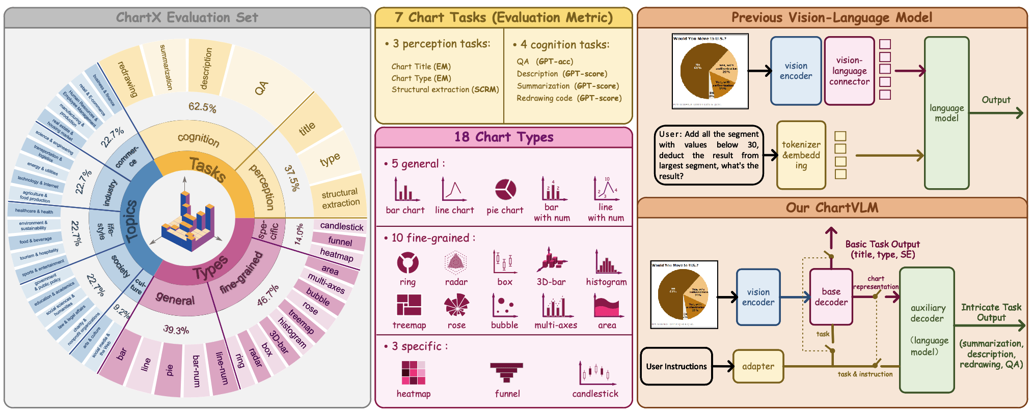
整体架构:由指令适配器、像素级编码器和文本级级联解码器对组成。指令适配器根据用户指令选择执行的图表任务,基础解码器负责提取图表信息,辅助解码器用于处理复杂的生成任务。
指令适配器:包含三个线性层,将多样化的用户指令映射到七个图表任务类别之一,使用 GPT-3.5 构建的数据集进行训练,验证子集上的准确率达到 100%。
级联解码器设计:基础解码器用于提取图表信息,若任务由指令适配器分类为基础感知任务,则直接输出文本表示;对于复杂任务,辅助解码器结合基础解码器的输出和用户指令进行操作。
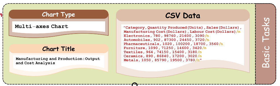
基础解码器使用 Pix2Struct-base 和 Pix2Struct-large 模型预训练权重进行微调,辅助解码器使用 LoRA 和预训练的 Vicuna-7B、Vicuna-13B 模型进行微调。
图片embedding
Cohere Embed v4 是一个能够满足企业需求的多模态嵌入模型,发布于 2025 年 4 月 15 日。它可以处理文本、图像和混合格式(如 PDF),非常适合需要处理复杂文档的场景。它的关键功能如下,
多模态支持:可以统一嵌入包含文本和图像的文档,如 PDF 和演示幻灯片。
长上下文:支持高达 128K 的上下文长度,约 200 页,适合长文档。
多语言能力:覆盖 100 多种语言,支持跨语言搜索,无需识别或翻译语言。
安全性和效率:优化用于金融、医疗等行业,可在虚拟私有云或本地部署,并提供压缩嵌入,节省高达 83% 的存储成本。
它们如何配合完成rag任务的?以下是它们协作的流程:
图像嵌入: 首先,使用 Cohere Embed v4 对所有图像进行编码,生成图像嵌入,并存储起来。
问题嵌入: 当用户提出一个问题时,Cohere Embed v4 也会将问题编码成嵌入。
检索: 系统将问题嵌入与图像嵌入进行比较,找到与问题最相关的图像。
答案生成: 将检索到的图像和用户的问题一起发送给 Gemini Flash 2.5,它会根据图像和问题生成最终的答案。
优点:节省资源
缺点:缺少可解释性,并且要求用户使用多模态模型问答,成本高
参考:https://mp.weixin.qq.com/s/qnXpmJzbvb01tW0IY9j4Qg
总结
现有chart->text方法分为三类:
多模态大模型直接识别:minicpm, qwen效果都挺好,但是至少得用半张卡来跑
图表->结构数据->大语言模型:省显存,但是效果不好
在rag中,除了chart->text,还可以试试图片embedding